
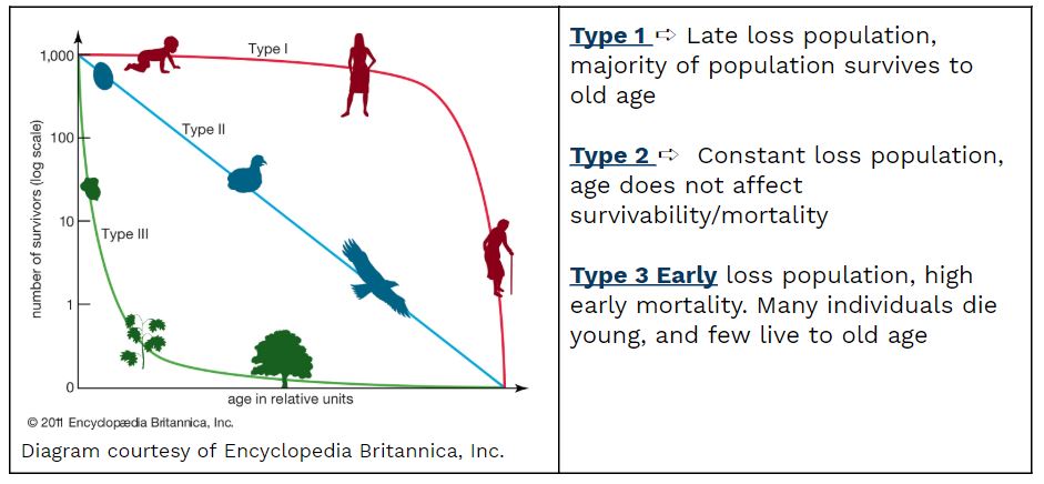
Survivorship Curves
Survivorship curves are used to compare the pattern of mortality between species. These curves show which member of which age groups die at which point. Essentially, it maps the pattern of mortality in a given species based on the way individuals were born and raised. Remember in the last section when we discussed K-selected versus R-selected species? These graphs help put into perspective how a population with a certain parental care rate/reproductive rate may look as individuals continue to age.
Type 1 shows a curve in which most of the population dies off toward their old age. This is representative of a K-selected species; it shows few offspring with high levels of parental care that lived to old age due to this attention to their specific well-being.
Type 2 curve shows a constant loss population that is not affected by age. Age doesn't determine survival or mortality. This curve shows that death is a constant regardless of age.
Type 3 curve shows a species that has an early loss population and few live to old age. This is what the R-selected graph looks like, since many offspring are born yet few survive due to neglect or unindividualized parental attention.
These three graphs are used to determine patterns of certain species and how birth rate or death rate correspond with levels of parental care to predict mortality at a certain age.
| Survivability | Type 1 | Type 2 | Type 3 |
|---|---|---|---|
| Early Age | High | High | High |
| Middle Age | High | Medium | Low |
| Old Age | Low | Low | Low |
| Example | Humans | Song Birds, Bees | Frogs |
| K/r | K | K | R |
🎥 Watch: AP Environmental Science Streams
Frequently Asked Questions
What is a survivorship curve and why do we need to know about it?
A survivorship curve is a line that shows the proportion of a cohort (same-age group) surviving from birth to maximum age—basically a visual life table. AP expects you to know the three types: Type I (high juvenile survival, most die old—common in K-selected species), Type II (constant death rate across ages), and Type III (very high juvenile mortality, lots born but few survive—typical of r-selected species) (CED EK ERT-3.C.1, ERT-3.C.2). You need to know survivorship curves because they summarize age-specific mortality and life-history strategies (fecundity, semelparity vs. iteroparity) which helps predict population growth, guide conservation/management decisions, and connect to carrying capacity and resource planning—all stuff AP asks you to explain or interpret on the exam. For a quick review, check the Topic 3.3 study guide on Fiveable (https://library.fiveable.me/ap-environmental-science/unit-3/survivorship-curves/study-guide/4vVOKIxNz6i89ct8qb0U) and more unit review (https://library.fiveable.me/ap-environmental-science/unit-3). For extra practice, use Fiveable’s practice problems (https://library.fiveable.me/practice/ap-environmental-science).
How do you read a survivorship curve graph?
A survivorship curve plots a cohort’s chance of surviving (y-axis: proportion or number alive) from birth to max age (x-axis: age). Read it by noting the overall shape and slope: - Type I: curve stays high then drops steeply near max age—low juvenile mortality, most die old (K-selected species; high parental care). - Type II: roughly straight, constant slope—equal chance of dying at any age (some birds, small mammals). - Type III: steep drop early then levels off—high juvenile mortality but survivors live long (r-selected species; many offspring, low parental care). Use it with life tables and fecundity data to infer age-specific mortality and life-history strategy. On the AP exam, you’ll be asked to interpret these visual patterns (Practice 2) and connect them to K vs. r selection (CED EK ERT-3.C.1–2). For a quick topic review check the Fiveable study guide (https://library.fiveable.me/ap-environmental-science/unit-3/survivorship-curves/study-guide/4vVOKIxNz6i89ct8qb0U), unit overview (https://library.fiveable.me/ap-environmental-science/unit-3), and extra practice problems (https://library.fiveable.me/practice/ap-environmental-science).
What's the difference between Type I, Type II, and Type III survivorship curves?
A survivorship curve graphs the proportion of a cohort surviving from birth to max age (useful with life tables). Type I: high survival through early/middle life, most deaths occur at older ages (humans, many K-selected species). Type II: roughly constant mortality rate across ages—straight-ish line (some birds, rodents). Type III: very high early mortality with few individuals surviving to adulthood; those survivors live long (many r-selected species like oysters, many plants). Remember: Type I/II often link to K-selected traits (lower fecundity, parental care), Type III links to r-selected traits (lots of offspring, little care). For AP ESSAY/MCQ tasks you might be asked to identify curve shape, relate it to life-history (fecundity, semelparity vs. iteroparity), or use cohort data—so practice reading curves and connecting to K/r concepts (CED: ERT-3.C). For a quick review, check the Topic 3.3 study guide on Fiveable (https://library.fiveable.me/ap-environmental-science/unit-3/survivorship-curves/study-guide/4vVOKIxNz6i89ct8qb0U) and hit the practice problems page for more examples (https://library.fiveable.me/practice/ap-environmental-science).
Why do humans have a Type I survivorship curve?
Humans show a Type I survivorship curve because most individuals survive to old age and then die suddenly near the species’ maximum lifespan. That pattern comes from low age-specific mortality in early and middle life, high parental care, low fecundity (few offspring), and investment in each offspring—all classic K-selected traits. Social factors (health care, sanitation, stable food supplies, low predation) push mortality toward older ages, so the curve is flat then drops steeply. On the APES CED this ties to EK ERT-3.C.2 (K-selected → Type I/II) and keywords like fecundity, cohort, and maximum lifespan. You might see questions about this on multiple-choice or free-response that ask you to explain why a species fits Type I vs. Type III. For a quick review, check the survivorship curves study guide (https://library.fiveable.me/ap-environmental-science/unit-3/survivorship-curves/study-guide/4vVOKIxNz6i89ct8qb0U) and practice questions at (https://library.fiveable.me/practice/ap-environmental-science).
I'm confused about what a cohort means in survivorship curves - can someone explain?
A cohort is just a group of individuals all the same age that you follow through their lives—from birth until the last member dies. Survivorship curves plot the proportion of that cohort still alive at each age (age-specific survival). The CED defines it exactly: “a cohort—a group of individuals of the same age—in a population, from birth to the maximum age” (EK ERT-3.C.1). You use cohorts to compare life-history strategies: K-selected species often show Type I (high juvenile survival, deaths late) or Type II (steady mortality), while r-selected species show Type III (lots of early deaths). For APES free-response or multiple-choice, be ready to explain survivorship using cohort-based terms and link curves to K vs. r selection (EK ERT-3.C.2). For a quick study refresher, see the Topic 3.3 study guide (https://library.fiveable.me/ap-environmental-science/unit-3/survivorship-curves/study-guide/4vVOKIxNz6i89ct8qb0U)—and try practice questions at (https://library.fiveable.me/practice/ap-environmental-science).
Which animals follow Type III survivorship curves and why?
Type III survivorship curves describe populations with very high mortality early in life and few individuals surviving to old age. Typical examples are r-selected species that produce lots of offspring with little or no parental care—think many insects (butterflies, mosquitos), many fish (cod, many marine fish), most marine invertebrates (oysters, sea urchins), amphibians, and some plants. Sea turtles are often discussed too: hundreds of hatchlings but only a few reach adulthood. Why? High fecundity + low parental investment means many young die from predation, starvation, or environmental stress early on (high age-specific mortality). Survivorship curves on the AP exam connect this idea to life-history strategies (r-selected → Type III; K-selected → Type I/II). Review the CED keywords (cohort, fecundity, semelparity/iteroparity) and check Fiveable’s Topic 3.3 study guide for a quick review (https://library.fiveable.me/ap-environmental-science/unit-3/survivorship-curves/study-guide/4vVOKIxNz6i89ct8qb0U). For broader review and practice, see the unit page (https://library.fiveable.me/ap-environmental-science/unit-3) and practice problems (https://library.fiveable.me/practice/ap-environmental-science).
How do K-selected and r-selected species relate to survivorship curves?
K-selected and r-selected species map directly onto survivorship curve types you need to know for the exam (see EK ERT-3.C.2). K-selected species invest more in few offspring, have lower fecundity, longer lifespans, and lower juvenile mortality—so their cohort survival typically follows a Type I curve (high survival early, most die old age) or sometimes Type II (constant mortality across ages). r-selected species produce many offspring, show high juvenile mortality, often semelparous, and so their cohort looks like a Type III curve (lots die young, few survive to adulthood). These patterns tie to life-history strategies, carrying capacity dynamics, and age-specific mortality—exactly the CED ideas you’ll be tested on. Review the Topic 3.3 study guide for examples and visuals (https://library.fiveable.me/ap-environmental-science/unit-3/survivorship-curves/study-guide/4vVOKIxNz6i89ct8qb0U). For broader Unit 3 review and tons of practice Qs, check the unit page (https://library.fiveable.me/ap-environmental-science/unit-3) and practice problems (https://library.fiveable.me/practice/ap-environmental-science).
What does it mean when a survivorship curve is steep vs flat?
A survivorship curve shows how many members of a cohort survive from birth to max age. A steep curve (big drop near the left) means high early-age mortality—most individuals die young. That’s a Type III curve, typical of r-selected species that produce many offspring with low parental care (e.g., many fish, insects). A flat curve means relatively constant survival at all ages—that’s a Type II curve, where mortality is about the same each year (some birds, small mammals). A curve that’s high and flat at first then drops late is steep only at the right end; that’s Type I, typical of K-selected species with low juvenile mortality and most deaths occurring at older ages (e.g., humans, elephants). On the AP exam you may need to identify curve types, link them to r- vs K-selection, and explain life-history traits—use the Topic 3.3 study guide on Fiveable for a quick review (https://library.fiveable.me/ap-environmental-science/unit-3/survivorship-curves/study-guide/4vVOKIxNz6i89ct8qb0U).
Why do most fish and insects have Type III curves?
Most fish and insects show Type III survivorship because they follow an r-selected life history: they produce lots of offspring (high fecundity), provide little or no parental care, and experience very high age-specific mortality early in life. Predation, starvation, and environmental hazards kill many juveniles, so the survivorship curve drops steeply at young ages; a few individuals survive to adulthood and then live longer. This matches EK ERT-3.C.2: r-selected species → Type III. Type III strategies maximize reproductive output when juvenile survival is unpredictable or density-independent. For AP exam framing, be ready to link high fecundity, semelparity/iteroparity differences, and age-specific mortality to curve shape (CED Topic 3.3). For a quick review, check the Topic 3.3 study guide (https://library.fiveable.me/ap-environmental-science/unit-3/survivorship-curves/study-guide/4vVOKIxNz6i89ct8qb0U) and more unit resources/practice questions at the Unit 3 page (https://library.fiveable.me/ap-environmental-science/unit-3) or the practice bank (https://library.fiveable.me/practice/ap-environmental-science).
Can you give me examples of animals for each type of survivorship curve?
Type I—high survival until old age (K-selected): examples—humans, elephants, many large mammals like whales. They have low juvenile mortality, parental care, and long lifespans. Type II—constant mortality across life (mix of strategies): examples—some birds (like many songbirds), small mammals (squirrels), and some reptiles. Death chance is roughly constant at any age. Type III—very high early mortality with few survivors to adulthood (r-selected): examples—most fishes (many marine fish), oysters and most other bivalves, many insects, and amphibians that lay lots of eggs. They produce many offspring with little parental care. These map to the CED: Type I/II often K-selected, Type III r-selected (EK ERT-3.C.1–2). For quick review, check the Topic 3.3 study guide (https://library.fiveable.me/ap-environmental-science/unit-3/survivorship-curves/study-guide/4vVOKIxNz6i89ct8qb0U) or the Unit 3 overview (https://library.fiveable.me/ap-environmental-science/unit-3). For more practice, use Fiveable’s practice problems (https://library.fiveable.me/practice/ap-environmental-science).
I don't understand why elephants and humans have similar survivorship curves.
They look similar because both humans and elephants are K-selected species that follow a Type I survivorship curve: high survival of young, most mortality concentrated at older ages. Both have low fecundity (few offspring), lots of parental care, long lifespans, and investment in each offspring’s survival—so cohorts show high early/ middle survival and steep drop near maximum age (EK ERT-3.C.1 and ERT-3.C.2). On the AP exam, recognize the link: Type I/II ≈ K-selected traits (low juvenile mortality, iteroparity, carrying-capacity life history). If you need a quick refresher, see the Topic 3.3 study guide (https://library.fiveable.me/ap-environmental-science/unit-3/survivorship-curves/study-guide/4vVOKIxNz6i89ct8qb0U). For more practice interpreting curves, try the Unit 3 resources (https://library.fiveable.me/ap-environmental-science/unit-3) or practice questions (https://library.fiveable.me/practice/ap-environmental-science).
How do you determine what type of survivorship curve a species has?
Look at a cohort’s survival-by-age (a life table or survivorship plot) and match the pattern to the three types in the CED. Key signs: - Type I: high survival through most of life, steep drop at old age (low juvenile mortality, K-selected, long lifespan, iteroparity). - Type II: roughly constant mortality across ages—straight-ish line on a log survival plot (intermediate strategy). - Type III: very high juvenile mortality with few survivors that live long if they reach maturity (r-selected, many offspring, often semelparous). Practically: use age-specific survival or % surviving vs. age and sketch/plot it (or use a life table). Compare shape to Type I/II/III and note links to fecundity and life-history strategy—that’s exactly what the exam asks you to explain (EK ERT-3.C.1–2). For a quick review, check the Topic 3.3 study guide (https://library.fiveable.me/ap-environmental-science/unit-3/survivorship-curves/study-guide/4vVOKIxNz6i89ct8qb0U) and more unit resources (https://library.fiveable.me/ap-environmental-science/unit-3). For extra practice, try Fiveable’s APES practice problems (https://library.fiveable.me/practice/ap-environmental-science).
What's the connection between reproductive strategies and survivorship curves?
Reproductive strategy and survivorship curves are tightly linked: r-selected species produce lots of offspring (high fecundity), often reproduce once (semelparity), and experience high early-age mortality—that creates a Type III survivorship curve (steep drop early, few survivors). K-selected species produce fewer offspring, invest more parental care (iteroparity/common), and have lower juvenile mortality with deaths concentrated at older ages—that gives a Type I curve (flat early, steep near max lifespan) or sometimes Type II (constant mortality across ages). Age-specific mortality, fecundity, and life history strategy determine the cohort shape you’d plot on a life table or survivorship curve (CED EK ERT-3.C.1–2). For AP exam practice, review the Topic 3.3 study guide on Fiveable (https://library.fiveable.me/ap-environmental-science/unit-3/survivorship-curves/study-guide/4vVOKIxNz6i89ct8qb0U) and try practice problems (https://library.fiveable.me/practice/ap-environmental-science).
Why do r-selected species usually follow Type III curves while K-selected follow Type I?
r-selected species usually show Type III curves because they produce lots of offspring (high fecundity) with little parental care and high early-age mortality. A cohort of those species loses most individuals young, so survivorship is very low at early ages but a few survivors live to adulthood (Type III). K-selected species invest more in each offspring (low fecundity, more parental care, iteroparity), have lower age-specific mortality when young, and many survive to old age—giving a Type I curve with high early survival and deaths concentrated near maximum lifespan. This matches the AP CED: survivorship curves show cohort survival (EK ERT-3.C.1) and differ by life-history strategy (EK ERT-3.C.2). For a quick review, check the Topic 3.3 study guide (https://library.fiveable.me/ap-environmental-science/unit-3/survivorship-curves/study-guide/4vVOKIxNz6i89ct8qb0U). For more unit review and practice, see Unit 3 (https://library.fiveable.me/ap-environmental-science/unit-3) and AP practice problems (https://library.fiveable.me/practice/ap-environmental-science).
Do any species have survivorship curves that change over time?
Short answer: yes—survivorship curves for a species can change over time or between populations. Survivorship curves (Type I, II, III) describe age-specific mortality for a cohort, but they’re not fixed species “labels.” Environmental change, population density, life-history plasticity, or human impacts can shift a population’s curve. How it happens: - If juvenile survival falls (habitat loss, pollution, predators), a population that looked Type I/II can move toward Type III (more early mortality). - If conservation or reduced predation raises juvenile survival, a formerly Type III pattern can become more Type II/I. - Life-history strategies (semelparity vs. iteroparity) and K- vs. r-selection influence typical curves, but local conditions and time cause variation. Why this matters for APES: exam questions may ask you to link survivorship curves to K/r selection, cohort life tables, or effects of disturbances. For a quick refresher on the CED concepts and example curves, check the Topic 3.3 study guide (https://library.fiveable.me/ap-environmental-science/unit-3/survivorship-curves/study-guide/4vVOKIxNz6i89ct8qb0U). For extra practice, see Fiveable’s APES practice problems (https://library.fiveable.me/practice/ap-environmental-science).